Prologue:
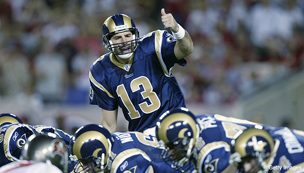
These are dark times in the Republic. The St. Louis/Los Angeles Rams have been forced from their home away from home to go, well, back home. Yes, the greatest fashion show on turf has been kicked to the curb and I can’t help but feel genuine sadness. You may recall the Rams placed 3rd in my NFL jersey rankings. My heart has not changed. I fear their change in locale will bring about an even more painful change: the uniform. Ay, I feel like i’m losing a son. The NFL’s uniform policy guarantees we’ll get to hold onto these a little while longer, but I do fully expect a change; probably, some sort of return to their old-school stylings. I told myself if they moved and changed I’d buy one just to have and now that is being tested. Dear reader, let us lament what we may soon lose:
That said, away we go…
Ah, the All-Star Break. What a time to be alive. The Mavs couldn’t get here soon enough. Meanwhile, Jeff Gordon-successor Chase Elliot has followed in the small footsteps of Austin Dillon and Danica Patrick by qualifying on the pole in his first Daytona 500 (paint scheme rankings, anyone?) The MLB is nowhere to be seen, and Chelsea FC appear to be on the rebound. Sounds like the perfect time to rank NBA unis.
The NBA is a weird place. This was friggin’ hard; way harder than the NFL rankings. If you call me out on a ranking, I may not even be able to defend myself. Why is that, you say? Well I think there’s several reasons. The league’s different eras are reflected in jersey changes much more so than the NFL, and NBA teams seem to try a lot harder to market themselves and rally their fan bases. Now we have a delicate balance between hipster fashion off the court and the paradoxically-paired baggy shorts and compression sleeves duo on the court. The NBA has had stupid logos, fun logos, badass logos, and everything in between. It’s sometimes juvenile, yet that’s part of the fun. Several teams go retro, with varying levels of success, while others are jumping into modernity at a faster rate than NFL teams. By having so many more games, the NBA gets to experiment a lot more with jerseys, which is great for fans, but hard for folks like me who try to keep up. I tried my best to focus on official home and away sets, particularly the aways since they’re more colorful (seriously, what’s with wearing white at home?). There are simply too many alternates to keep track of. I was a little more forgiving for teams fixated on tradition, partially because I think it translates better to NBA jerseys, who I think also do significantly better with color, unless its red and blue.
Final pre-ranking notes and recurring themes: I think the NBA’s jerseys can be a bit more rigidly defined as “bad” or “good” than the other leagues. One problem these teams have is they incorporate basketballs way too much. I don’t know what it is with Americans and using the ball as such a big part of the logo. The USA soccer crest belongs on a 6-year old’s first jersey. The Buccaneers feature the jolly roger clutching a football. The Knicks forwent any creative design whatsoever and threw out a ball in a basket. Do better. I also struggle with NBA jerseys because I think words/city names look better across the chest than pictures, which seem weird and leave too much space on the side, but the Warriors have ushered in the era of images and dozens of alternates have followed suit. I like sleeved jerseys and would rather purchase a sleeved over a tank, whenever that becomes socially acceptable, but admittedly, they look silly with super baggy shorts so I know they won’t catch. I used this link as a guide for some of the pictures and reference it mostly for alternates (all other pics were google searches). It’s a fun read either way. Follow along.
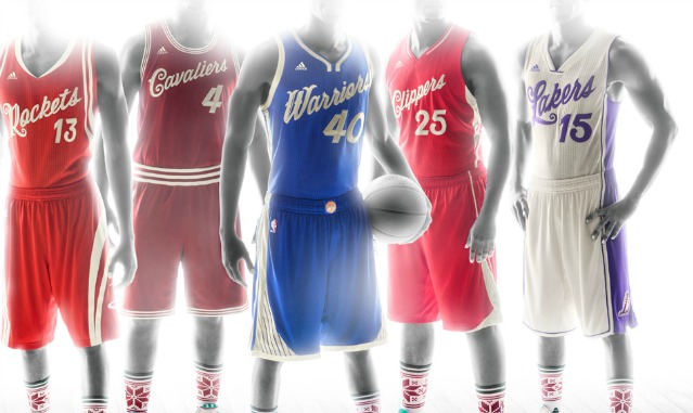
Lastly, I’d like to kick off this piece with a nod to this year’s Christmas collection, which I thought was classy, timeless, and just an all-around great set of jerseys. Positively gorgeous. Feast your eyes:
Now, without further adieu…
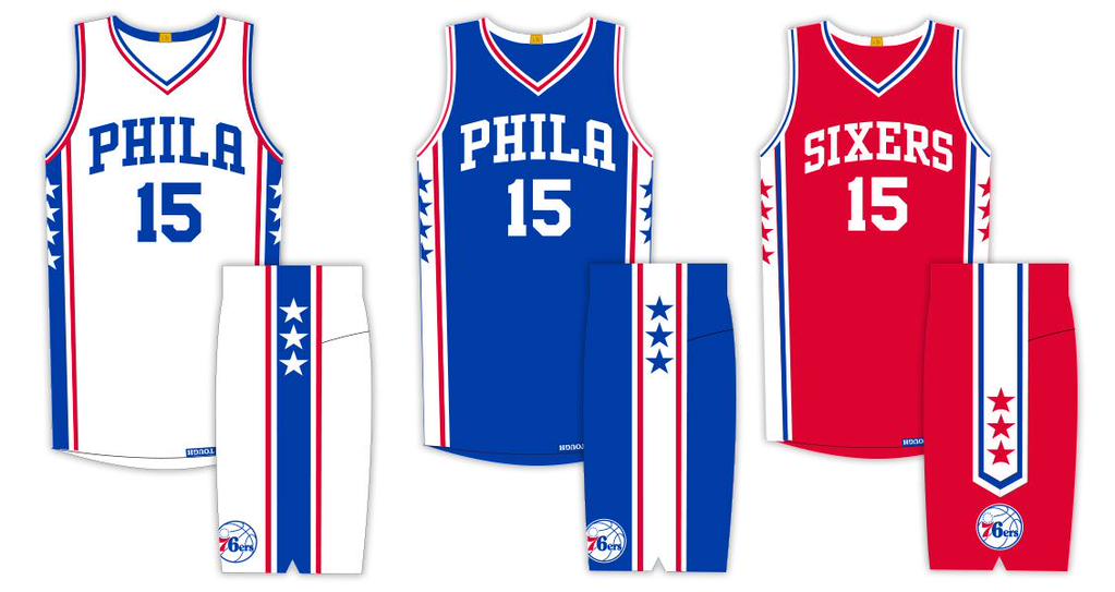
30. PHILADELPHIA 76ers
Stinkers on the court, stinkers on the runway. The 6ers now make league-worst teams 2 for 2 on my rankings’ lowest spot. The Iverson-era black/gold theme was brilliant and personified the 90s. Time moved on, their graphic designer didn’t; the dude regressed. As I mentioned in the NFL rankings, lighter blue and red never look good, and when you put them together as the team recently did, bad things happen. It’s time to be more independent. That dribbling Ben Franklin logo is merely a distraction from the travesty that took place in our nations first capital. Nothing to see here, folks.
29. DENVER NUGGETS
Baby. Blue. With yellow, of all colors. Some people think these colors are a gold mine. Bruh… It would be easy to put them at 30, and they absolutely should be at 30, but I felt philly should be punished extra for ruining a good thing. The nugs simply don’t know better.

28. NEW YORK KNICKS
Dear god, no more bad shades of blue and orange, please. At least use black instead of white. All attempts to use blue and orange should refer to Broncos, Denver. Jersey sucks, logo sucks, Knicks go nowhere.
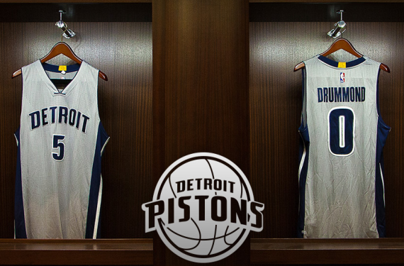
27. DETROIT PISTONS
More blue and red. As you can probably see, i’m getting bored of bad color schemes. When mediocrity piles up, writing suffers. Their new gray alternates are impressive, so not all is rotten in Detroit.
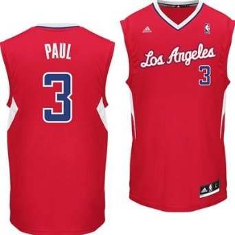
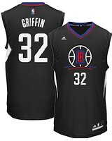
26. LOS ANGELES CLIPPERS
The Clippers…I hate the clippers. Deandre’s indecision, the comparisons to the Lakers, Blake Griffin’s Kia commercials, everything about this team sucks. They should probably be a tad higher because I like their new jerseys a lot more. The red ones featuring a revamped logo next to the number is creative and praiseworthy, and using black lettering on the whites reigns in the bad blue and red. But they will be punished for the aforementioned reasons, and most importantly because of their inability to change the old jersey sooner. More tired blue and red. It never ends! I don’t know why people hate the new redesigns, it blows the old jerseys out of the water. I couldn’t hate the old ones less. Overall, these look creative but not overdone, the black alternate looks cool, and everything just looks bolder and sleeker.
old:
new:
…the improvement is inspiring.
One final note: they have a baby blue and red throwback that is quite literally one of the worst pieces of clothing I’ve ever seen. The Sacramento Kings will wear a very similar one this year that is slightly better only because of the jersey font. You can google those yourself because I don’t want that schlock linked back to here. Let’s just say it sounds like they spent too much time with Skillz that Killz.

25. ORLANDO MAGIC
Pinstripes??? The color scheme calls to mind the Carolina Panthers, though fortunately there are no ill-advised helmet stripes or oddly shaped cat heads to be found. But pinstripes? Desperately need a revamp. I don’t want to talk about it more.
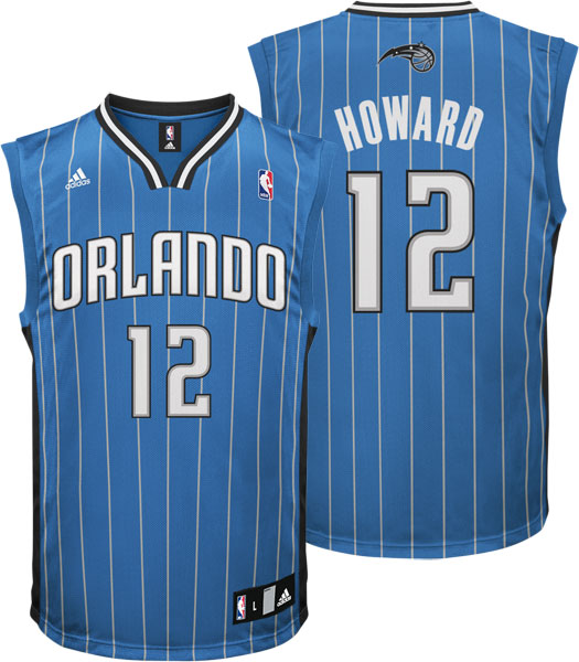
That jersey is obviously a bit outdated, but seriously, everybody down your bloodline knows what the magic look like.
24. UTAH JAZZ
Oy, what a mess. Utah and jazz. Utah. And jazz? I am not jazzed about these at all. I mean, seriosuly, which am I supposed to go off of?
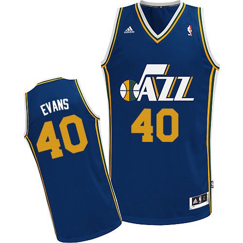
Bonus points for these relics:

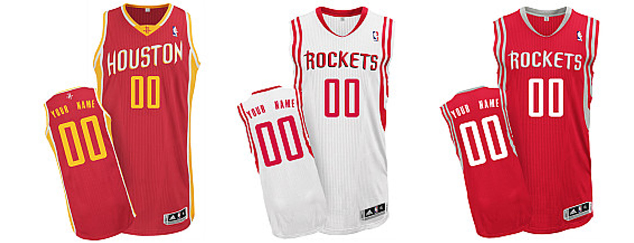
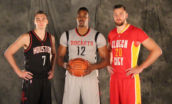
23. HOUSTON ROCKETS
I don’t like the rockets, especially the James Harden-led rockets. Red and white should be a recipe for success and yet I can’t help but feel uncomfortable watching them. Perhaps its the silver – they should buck that. Clutch city, as you will see on a particular alternate, is a dumb name. Red, yellow, and white are an eyesore together. Silver alternates remind me of the Patriots. Boo. Hiss.
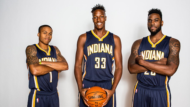
22. INDIANA PACERS
Blue and yellow means you’re racing to disaster. This team is on pace for further decline. They should draft a new design ASAP. Puns aside, auto racing has somehow made its way into the second straight rankings and neither time was it for a good reason. Ok, I guess they’re not that bad, but everybody else above them has better. I applaud them for having a name relevant to the better side of their state, but when you invite comparisons to a sport centered on colorful and badass cars, don’t bore your fan base with tired blue and yellow. Maybe those inevitable ads on jerseys will spice these up? Ugh I can’t believe we’re getting ads on jerseys.

GUYS! These alternates may be an homeage to film, but that doesn’t make them look any better. To think people criticized the NFL’s color rush unis…
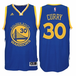
21. GOLDEN STATE WARRIORS
I liked the old jersey, corny as it may be, and I cried when they revealed that what they’d cooked up was these awkward shades of blue and yellow. Truth be told, they belong down there with the Nuggets. My distaste for this color scheme runs white hot. That said, the circular logo with enclosed number is very pleasing to the eye, though as I said in the intro, pictorial jerseys weird me out a bit. The text and number fonts are also nice. Is that enough to raise them to 21? Caught me off guard, too…
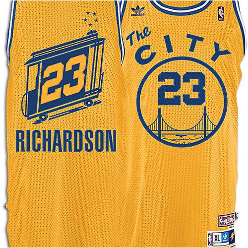
The spacing in The C I T Y makes me cringe, almost as much as the thought of using a throwback jersey as an alternate to a throwback jersey. I guess the trolley is cool. Could they not do anything remotely modern?
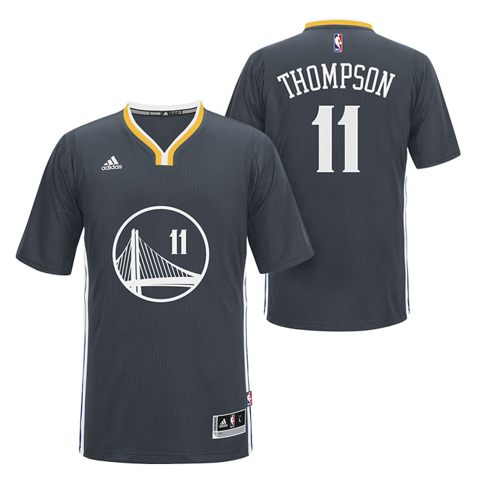
Why, yes, the could:
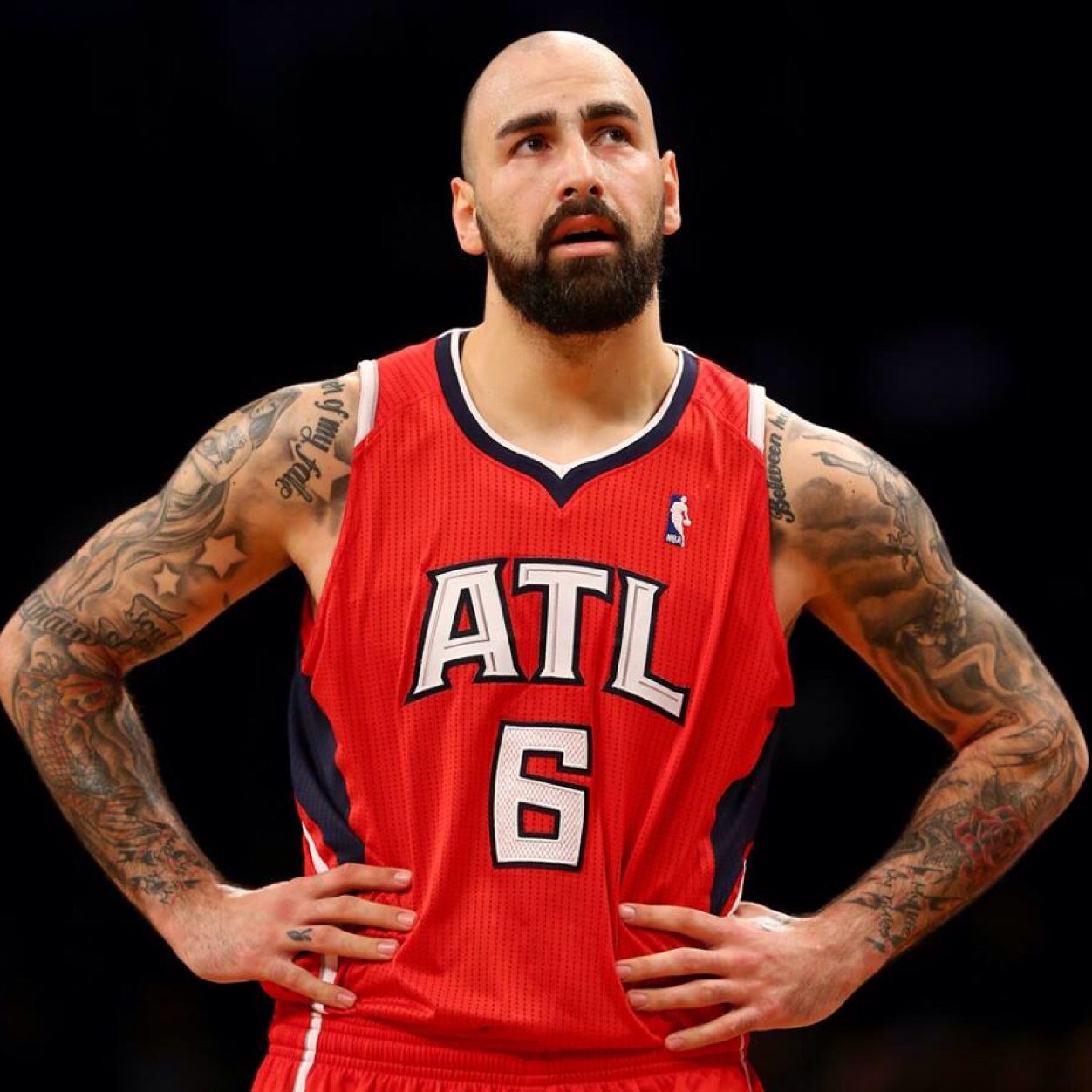
20. ATLANTA HAWKS
Here is Macedonia’s own Pero Antic rocking last year’s kit:
Now here is this year’s:

Now STOP SCROLLING. Look at these for a moment. Then watch the first 10 seconds of the following video (or really, all of it), to see how I personally felt when I first saw these unveiled.
Last year the Hawks showed us how good red white and blue can look when red is the primary color, and the new minimalist logo is genius. Well they took their re-imagining a step further and absolutely wrecked it. The new yellow must represent the bile those new jerseys induce. Also, what’s with the textured backgrounds? They are this high because of three specific reasons: 1) how good last year’s jerseys were; 2) the shade of red in the new ones is stunningly beautiful; 3): black beats blue. It hurts me to put something with so much potential so low, but the yellow coupled with the eccentric designs makes them look like the Terrapins of Maryland, after that terrapin was run repeatedly over by a car.
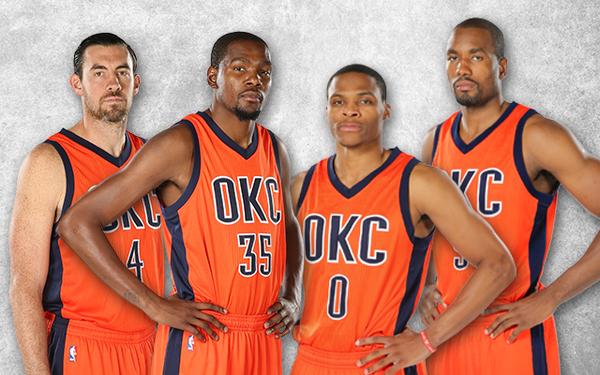
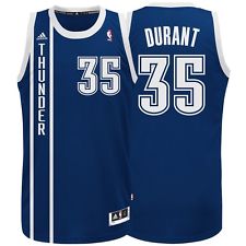
19. OKLAHOMA CITY THUNDER
Now that the taste of bile is out of our mouths, we can focus on a team that has some upside. It can’t be tooo much fun being a Thunder fan, though, what with the perennial second/third-place status and all. However, they do blue and orange better than the Knicks since it feels slightly darker and the shade of blue is a pleasant one. Plus, their logo, as meh as it is, is still infinitely better. It’s really just all around better execution.

Plus, they really stepped up their alternate game:
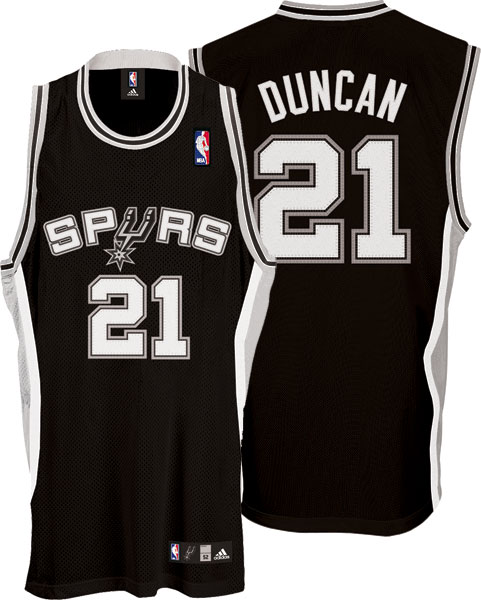
18. SAN ANTONIO SPURS
I originally had the spurs a bit higher, and then I realized what I was doing. How could I rank the Raiders so low and then put the Spurs in the top half? One can never go wrong with black, and yet silver has never brought to mind anything better than sweatpants. The combination simply cannot look better than plain and drab. Ugly? No, not at all. But they must’ve felt spurned when they hired their graphic designer. Very uninspiring.
17. WASHINGTON WIZARDS
The ol’ red, white, and blue got a pass here. I’m not really sure why, but when I look at their jerseys I just don’t feel the same kind of upset I do when thinking about the jerseys before them. ‘Merica. I tend to really dislike teams changing color schemes in addition to logos/schemes, so I’m gonna use this space to pay my respects to their old digs, which remind me a bit of the Seahawks’ gun metal unis of days long gone.

Now to the feature presentation…

As far as magical and inanimate object-featuring logos go, these are solid.
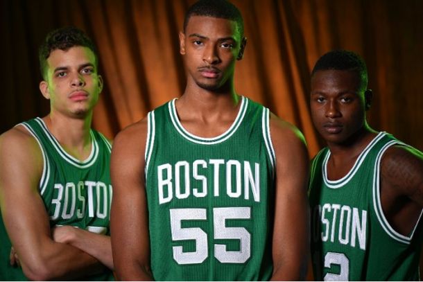
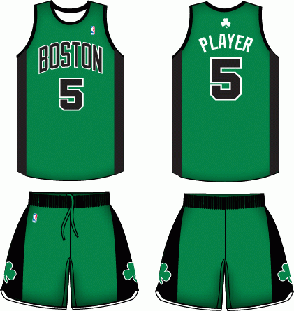
16. BOSTON CELTICS
Green and white. Meh. The Jets did it better. It’s a classic look that avoids looking too dull, but not much to celebrate either. Not sure why they wanted to make it look like a football uni with massive numbers. One of the most hideous logos in sports.
Yes, they do look bored. Because they weren’t lucky enough to get photographed in these:
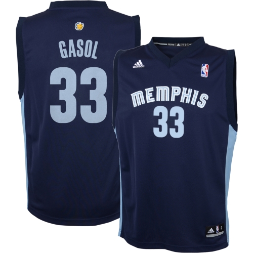
15. MEMPHIS GRIZZLIES
I originally had them at no. 12, but I struggle with this one. I can’t say I love the font, but it’s easy on the eyes and I don’t dislike it. The colors are also quite unique, and yet it almost feels awkward. Is it the stylization of the numbers? I don’t know. If anybody can better say what i’m trying to say, please help me out; I just have some weird visceral discomfort with it. For a reason I can’t describe this just doesn’t look like a basketball jersey to me. But it was still originally 12. Go figure.
14. PHOENIX SUNS
This team seems stuck. Getting lit up in the west and burned on the drawing board. Maybe its because “Suns” is one of the most inflexible names you could think to work with, or maybe its because italicizing a logo is a desperate cry for creativity, but they should probably scrap everything and just stick with the black PHX kit. That one’s great. Nothing else offers much to work with. Props for purple.
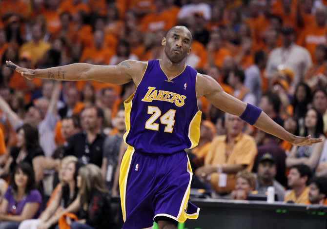
13. LOS ANGELES LAKERS
I’d strongly prefer the predominant purple over yellow, but the scheme in general is relatively easy on the eyes. They figured out how to make a jersey last and not seem outdated, though it doesn’t amaze me either. The Lakers present us with one of the few instances in which i’ll actually give points for tradition. I simply don’t want them to change it, it must stay as it is.
I’m pretty sure their actual base color this year is yellow, but this is way better:
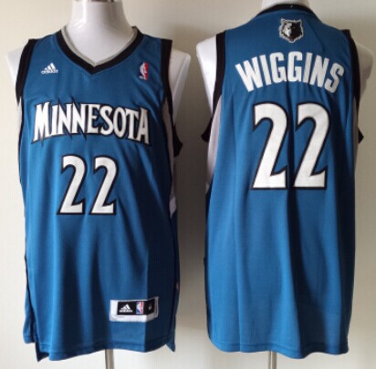
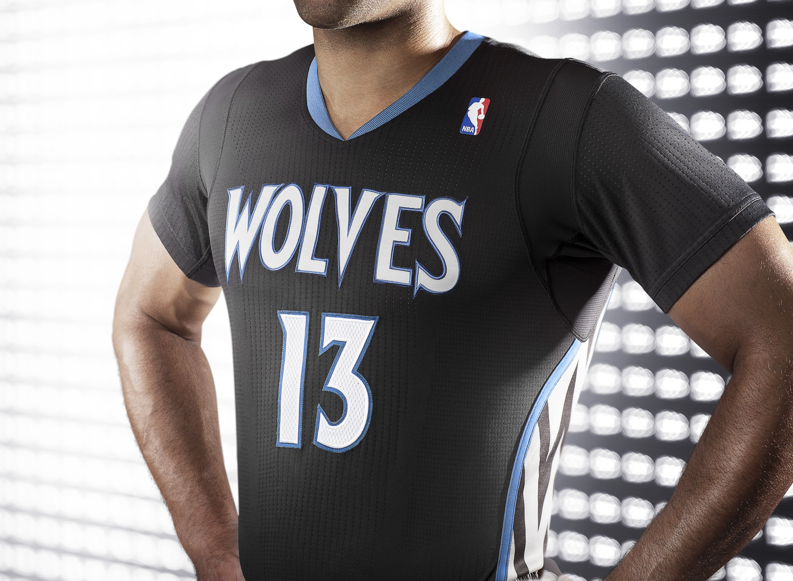
12. MINNESOTA TIMBERWOLVES
Fun fact: when I was a youth basketball league-playing youngin’, I suggested Timberwolves as a name to my team. We finish that undefeated season as the Black Hurricanes, which was admittedly better, but the name has stuck with me. That said, the wolves have always struck me as a bit of a forgotten team. No aura of historial greatness, no obnoxious colors to make them stand out, no obnoxious all star to draw undue attention. Yet while nobody was looking they assembled a pleasant ensemble that perhaps won’t win any fashion contests, but if you gave me one I’d like to keep it around. That’s still probably not enough to warrant a no. 12, but the black alternate sure is.
11. SACRAMENTO KINGS
I love purple and black, and the silver/white actually adds nice contrast. Logo and name are boring as hell, though. To be honest, the jersey design is not particularly inspiring either, but I like the colors too much.

Props for the Rochester throwback, as ugly as it is. I’m sorry for the image below; I post a photo only out of love for the 585.

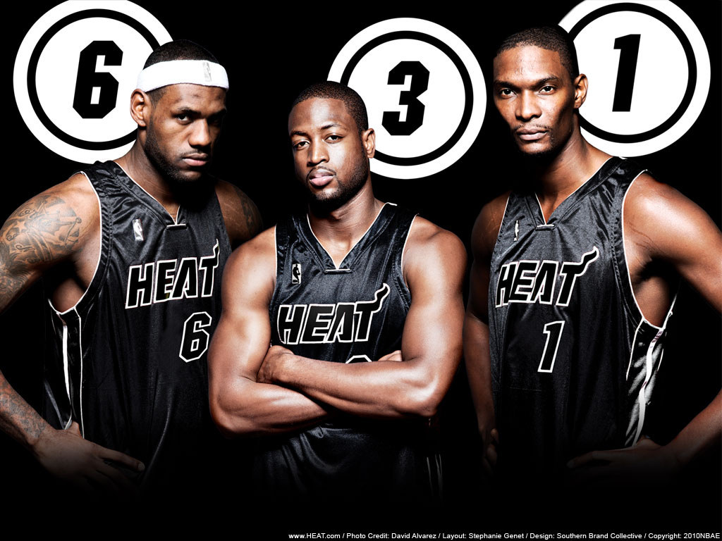
10. MIAMI HEAT
Colors look cool, logo is boring. Little flame thing on the T is cool, team name is boring. The main reason they are this high is because their primary shade of red is one of the best in sports, even if it doesn’t equate to one of the best jerseys. Could use an update but I don’t think anybody’s complaining here.
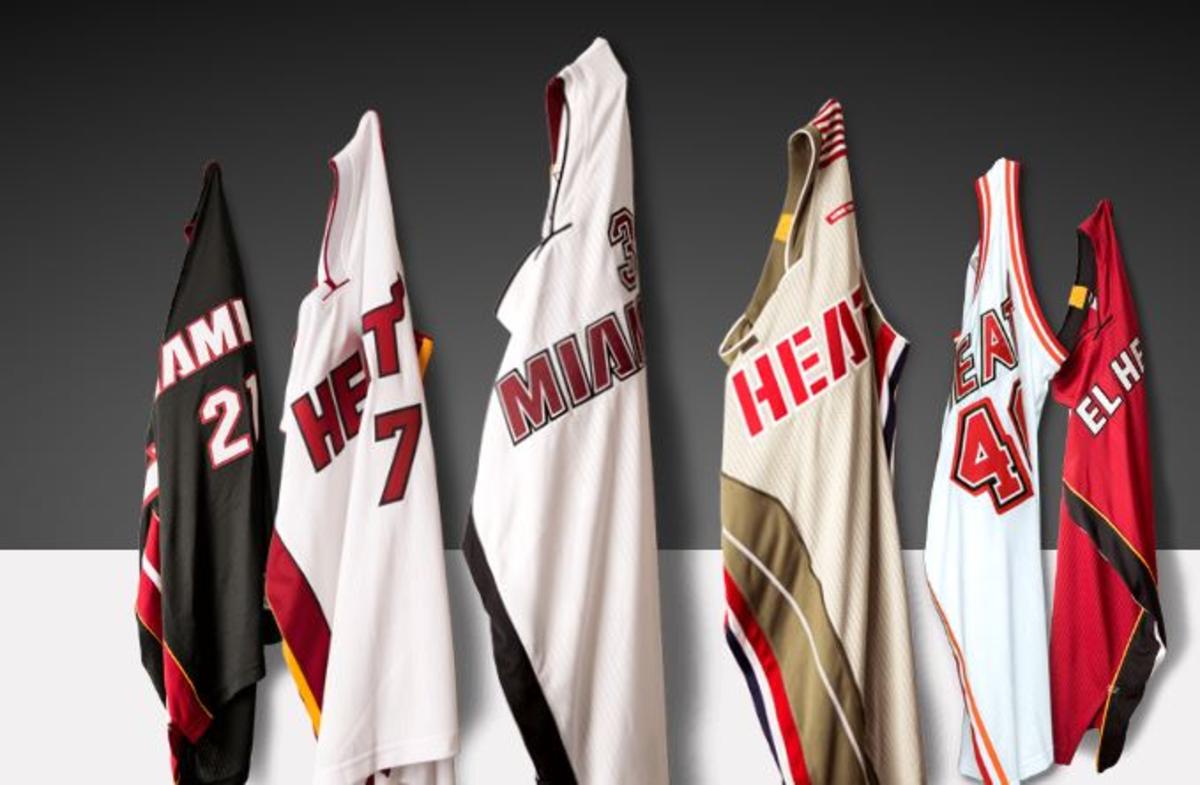
With the exception of the 3rd from the right, they all look good. The all-black alternates are terrific, too. I see why LeBron wanted to come here.
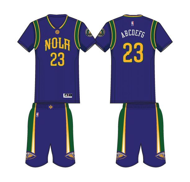
9. NEW ORLEANS PELICANS
We live in a world where people chose to name a team the Pelicans. But you know what? This could’ve gone way worse. Silly name aside, we got to see the Hornets return to Charlotte, and perhaps more importantly, we got to see this:
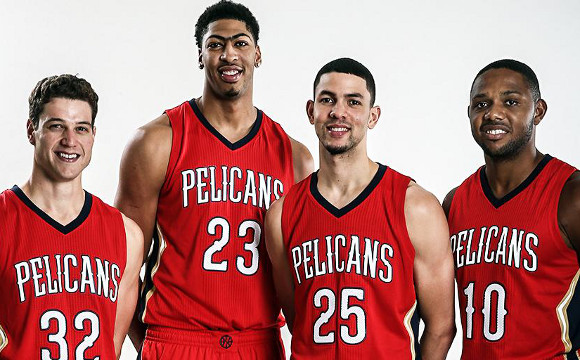
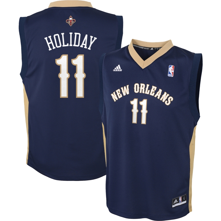
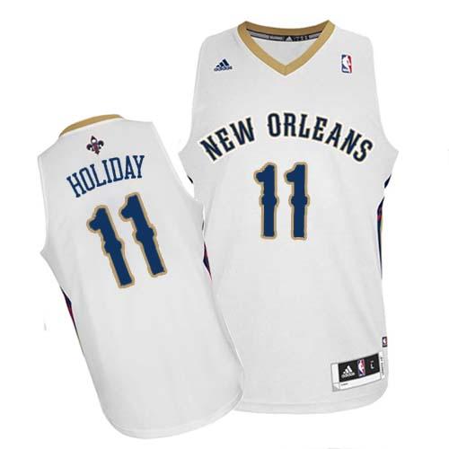
Sure, the logo may be a bit excessive, but considering the amount of anxiety I feel leading up to a new unveiling, I was ecstatic to see what I did. The colors are unique and work well together, the logo does its city service, and overall I’m just a happy camper here. They could’ve had no. 8 or 7, but we can’t just pretend the mardi gras thing doesn’t exist:
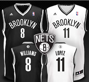
8. BROOKLYN NETS
I’m probably being a bit generous here, as the overall aesthetic is a little too simple for my usual liking, but the black and white look great, the logo is cool, and there’s just nothing to dislike whatsoever. Well done, folks.
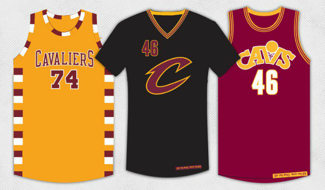
7. CLEVELAND CAVALIERS
I will start by saying I sorely miss the jerseys of the first Lebron era, but these new ones ain’t half bad. I surprised myself a bit with how high they are. The redskins could learn a thing or two about red and yellow from the Cavs.
Here’s the old, which probably would have cracked top 5 during their time:
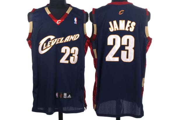

The text is perfect, the colors go well, and it’s just an all around elegant design.
And here’s the new:
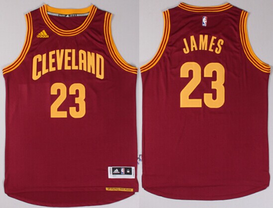
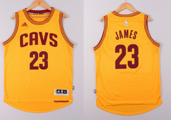
Certainly a downgrade; how can you not miss the blue? In the end, though, Iowa State should be proud. Extra points are also awarded for a pretty nice suite of alternates. The middle black is one of the best jerseys in the league and the basket in the right one is quirky yet effective. The left one is forgettable.
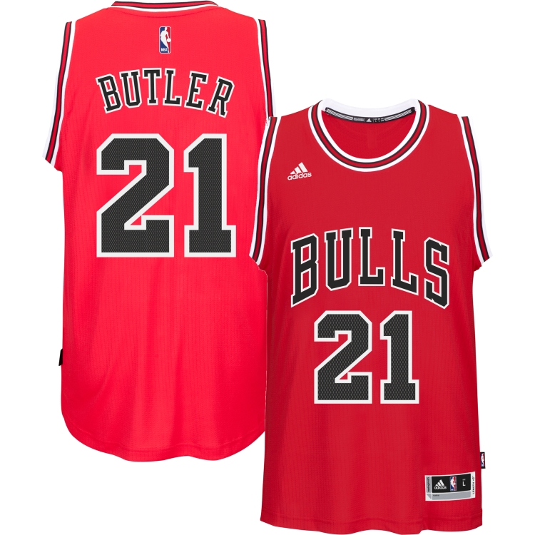
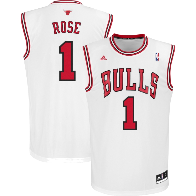
6. CHICAGO BULLS
Quintessential example of timelessness. A lone caveat: the logo is so ugly and absurd I have to ask myself if grown men actually stand behind it. However, it couldn’t be anything else. I wouldn’t oppose a new logo, but they are well inside the top 10. Chalk it up to red and black. Speaking of which, the black alternate is also up there with the best in the league. I do find the white in the red jersey distracting; I wish teams could find a better way to use white. As noted in the NFL rankings, too much white “neuters” badass colors.

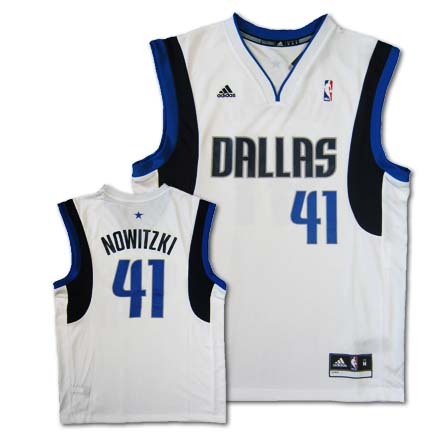
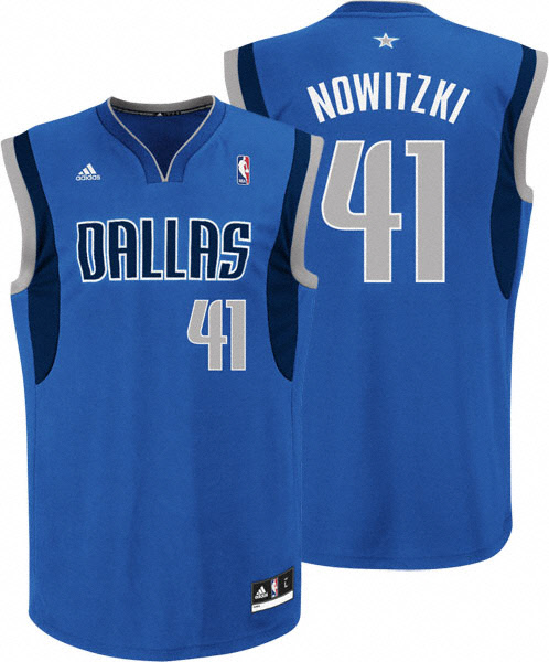
5. DALLAS MAVERICKS
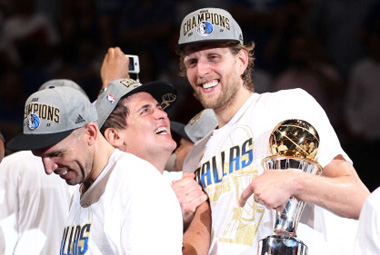
You may be asking yourself: which came first? my fandom towards the team or towards the jerseys? Jason’s teams have now scored top-5 on 2 consecutive rankings. But there is a method to the madness. Allow me to digress. I alluded earlier to my youth basketball days. Rewind even further to the registration period before my first season. Papa Sif and I were tossing a football in the yard when I asked him if I could play basketball. He said yes. I said sign me up. He said ok. I said now. He said ok. He used the garage phone to “call” the IAA and sign me up. I asked which team I was on. He said the Mavericks. I’m not sure why he chose them as a fill-in until he could actually register me, but from then on my fate was sealed. I followed their website. I watched highlights. I bought a Steve Nash toy. I owned (and still own) a Dirk jersey. I aged further. I watched them fall to the Heat in 2006. I watched them beat the Heat in 2011. I watched them blow up a terrific team. I now watch them flail for free agents year in and year out. It’s all based on a lie. But that’s ok. I’m glad it worked out that way because they’re a damn good looking team.
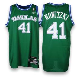
I adore the color scheme, adore the logo, adore the Dirk. I miss the navy aways featuring DALLAS and was reluctant to embrace the lighter blue as a base color, but I like the overall scheme a lot and it has grown on me. Not terribly original, but it looks both simple and fresh. They were originally higher, but I thought the top 3-4 had too much pizzazz to keep up with. Plus, I have to dock many points for terrible throwbacks. The font, the white, the green, the logo; it’s all gross. Their new skyline alternate looks great, who cares if it’s a ripoff.
old:

continuous:
newer alternate (beautiful):

less favorable current aways but still great:
alternates:

gross:
and just so we don’t end on a bad note:
4. PORTLAND TRAIL BLAZERS
Red and black are obviously great, but I must admit the logo has always left something to be desired. It’s good, but doesn’t blow me away. That said, I think they do a good job of keeping a bit of traditional appeal while not feeling outdated. Plus, I like when teams do a little something with the bottom of the jersey. It’s under-appreciated real estate. Elegance and colors win out here.
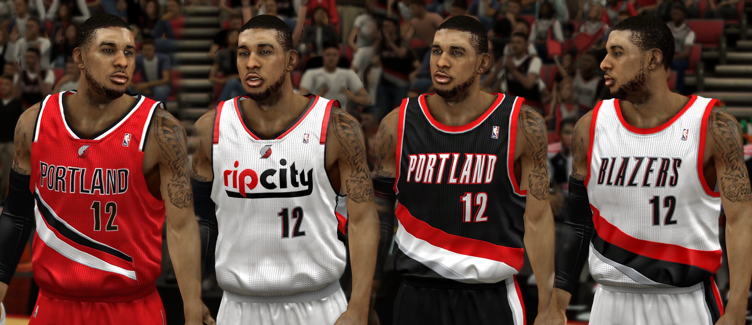
Extra points for the alternate; here it is again:
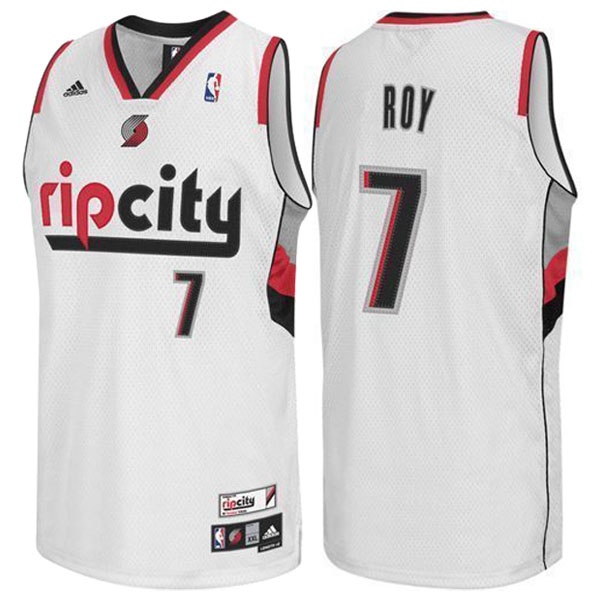
I’m not sure where rip city comes from (ah, here it is), but it’s got a nice ring to it and whoever picked the font and thought to put the logo at the collar should be handsomely rewarded.
Bonus note: it still seems weird to me that Oregon has a basketball team.
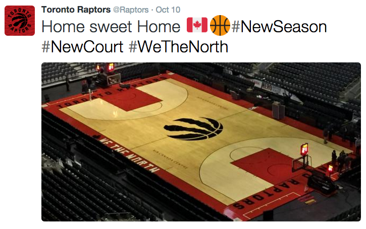
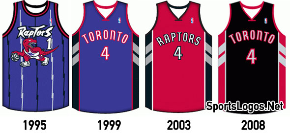
3. TORONTO RAPTORS
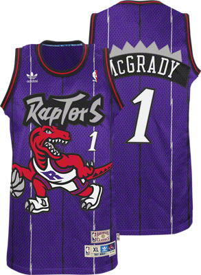
This team had a dinosaur on their jerseys. A professional sports organization had a dinosaur on their jerseys. We all miss the old raptor on purple, as it encapsulated the fun of the 90s, where it was so absurd that it was ok and became part of the fun. However, extinction means you’ve got something new, and you’ve gotta commend them for this new set.

The text is a little too curved, but the colors are stunning, the font effective, the design attractive, the logo simple yet eye catching.
The court redesign is stupendous and badass. Can not give them enough praise:
For funsies:
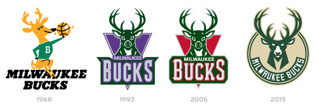
1 (YES, WE HAVE CO-CHAMPIONS). MILWAUKEE BUCKS
Perhaps the best makeover I’ve seen in recent memory. I’m sad to see the old logo go, though not because it was particularly good, but because I like deer. Elegant, adorable creatures, they are. Patronus-worthy, even. Look at it:

Also, check out how underrated they apparently always have been, via this link.
But man these things are nice.


THIS is how you do green. Take note. Take lots of notes. Logo is genius, green/gold/blue scheme is clever and commendable. Black alternates are pictorial jersey perfection. Court redesign is also terrific.

I was blown away when the Bucks unleashed their new sets, and I know you were too. As great as they are however, I have to give equal credit to the league’s other recent overhaul…
1 (CO-CHAMPIONS). CHARLOTTE HORNETS
Charlotte, Charlotte, Charlotte. How we missed you. As egregious as the introduction of a team named “Pelicans” is, it means we got to see the Charlotte Hornets once again. What a comeback it was. Feast your eyes on one of the finest pieces of sportswear you can see today:
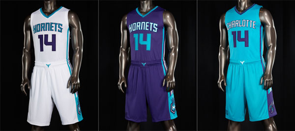
Ok, to be honest, I can see people disagreeing with this one. Even i’m not the biggest fan of aqua blue. But i’m a big fan of purple and that middle jersey can not be made better in any way. The hornets boast one of the best color schemes with a simple yet elegant design and one of the most badass, if slightly cheesy, logos in sports. Graphic designers take note, this is how you respect tradition while looking ahead. The Buzz City alternate is playfully awesome.

How the hell did they make white work? How did they get away with a silly nickname? How much more do they have to pay the guy who designed the beedrill logo for it to be just? I don’t know the answer to any of those, but I do know perennial journeyman and current Hornet Jeremy Lin is still playing in Ryan Wittman’s NBA spot.
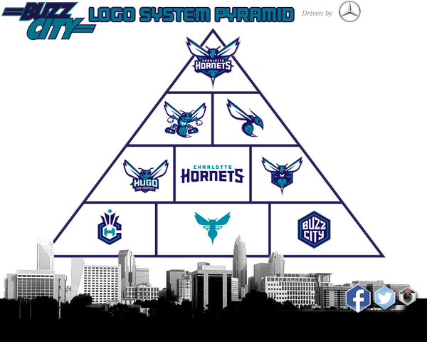
In all seriousness, I gave the Hornets the last spot, despite being tied, because a) Buzz City, b) purple beats green, and c) for simply having assembled this graphic which showcases just how much better their graphic design department is than everybody else’s:
Court shot:
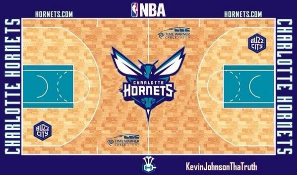
I don’t like the shading on the court, but that logo…
You may be asking why those previous 3 points were not enough to break the tie. Well, it’s simple really. While it’s partially because I care not for aqua blue, the Hornets should be commended for making it work, and I just felt guilty for putting the Bucks at no. 2. I think these two teams simply turned the league on its head by successfully revamping their kits so close together and I thought they simply stand in their own echelon. I know those 2 spots would change depending on the day so I chose to not choose.
Final notes:
You know what? The top 5 and bottom 5 are pretty locked in (though the order within those 5 may change), but I feel the rest could almost be swapped interchangeably depending on the day. With so many alternates it’s hard to say one team has a better set than another. I was way more forgiving with color scheme here than I was with the NFL, and it was hard to weigh those colors and all the alternates. Perhaps you should think of these less as rankings and moreso as more-or-less-favorable analyses (except the top and bottom 5, those are inarguable).
Go Mavs.
